

Air pollution is a pressing global issue, and its impact on public health cannot be overstated. In densely populated areas like Auckland, monitoring and analyzing air quality data is crucial for informing policy decisions and protecting communities. However, the sheer volume and complexity of this data often pose significant challenges for researchers. This is where automation comes into play.
The Challenge
The Auckland Council has been actively involved in monitoring air quality across the region, but the manual processing of large datasets from multiple monitoring stations was becoming increasingly cumbersome. The data, which includes PM10 speciation analysis, required extensive cleaning, processing, and visualization to identify pollution sources and trends. Without an automated system, researchers spent countless hours on repetitive tasks, limiting their ability to focus on deeper analysis and decision-making.
The Solution: PM Insights Pro
To address these challenges, we developed PM Insights Pro, an automated workflow solution leveraging Python, Shiny, and Docker. This tool streamlines the entire data processing pipeline, from ingestion to visualization, allowing researchers to quickly generate insights and reports with minimal manual intervention.
Key Features of PM Insights Pro
- Data Ingestion and Storage:
We designed a cloud-based storage system using Microsoft OneDrive to manage datasets and related documents in real-time. This ensures that all team members have access to the latest data, while backups are maintained locally to prevent data loss. - Data Processing:
Using Python libraries like Pandas, NumPy, and Matplotlib, we created a robust data processing pipeline. This includes cleaning raw datasets, handling missing values, and transforming data into a usable format. For instance, we processed three distinct datasets from the Queen Street monitoring station, each requiring specific cleaning and transformation steps. - Trend Analysis and Visualization:
PM Insights Pro generates a variety of visualizations, including:- Monthly PM10 Contribution Over Time: A line chart showing the long-term trend of PM10 concentrations.
- Yearly Average Contribution Values for All Elements: A bar chart comparing the yearly changes in pollutant concentrations.
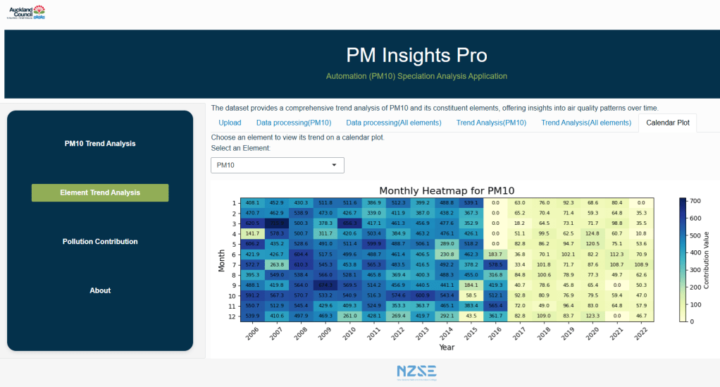
- Heatmap Calendar: A heatmap providing a detailed view of monthly changes in pollutant concentrations over the years.
- Pollution Source Breakdown: A pie chart illustrating the contribution of different pollution sources (e.g., sea salt, diesel vehicles, biomass burning) to PM10 levels.
- User-Friendly Dashboard:
Deployed via Shiny, our dashboard offers an intuitive interface for researchers to upload datasets, view processed data, and explore visualizations. The dashboard is designed to be customizable, allowing users to select specific datasets and visualization types based on their needs. - Stable Environment with Docker:
To ensure consistent performance across different systems, we used Docker to create isolated environments for the application. This eliminates conflicts between system dependencies and ensures that the tool runs smoothly on any machine.
The Development Process
Challenges Faced
- Learning Curve with Shiny and VS Code: Integrating Python code with Shiny using VS Code was initially challenging. We had to troubleshoot numerous unrecognized errors and adjust our approach repeatedly to ensure seamless integration.
- Environment Stability: Running Shiny in VS Code was unstable due to environment conflicts. Docker proved to be a game-changer, providing a stable and reliable runtime environment.
- Performance Optimization: The Shiny app was slow with our initial structure. By separating the code into different sections and using a main script to trigger branch scripts, we optimized the app’s performance.
Key Achievements
- Efficiency: Researchers can now generate cleaned reports and visualizations with just a few clicks, significantly reducing manual involvement.
- Stability: Docker ensures that the application runs smoothly, regardless of the user’s system configuration.
- Reusability: The automation pipeline can be adapted for other monitoring station datasets, making it a versatile tool for air quality analysis.
Future Directions
While PM Insights Pro has already proven its value, there are several ways we can enhance its capabilities:
- Real-Time Data Integration: By connecting to APIs from labs like GNS Science, the tool could process real-time data, providing up-to-the-minute insights.
- Predictive Analytics: Integrating machine learning models could enable predictions of future pollution trends, helping policymakers make proactive decisions.
- Automated Reporting: Adding a feature to generate reports with predefined text templates and dynamic analysis results would further streamline the workflow.
- Cloud-Based Computing: As datasets grow, transitioning to a cloud-based solution would allow for more efficient and rapid data processing.
Conclusion
Automating PM10 speciation data analysis has transformed the way researchers at the Auckland Council monitor air quality. By reducing manual involvement and providing actionable insights through visualizations, PM Insights Pro empowers researchers to focus on what matters most: protecting public health. This project not only showcases the power of automation in environmental science but also highlights the potential for technology to drive positive change.
You can explore the PM Insights Pro dashboard and learn more about the project on our GitHub repository and project portfolio website.


留下评论